
TUTORIAL – Venice Sunset Tonal Study
Denise Schoenberg shared this tutorial with us – have fun trying it out
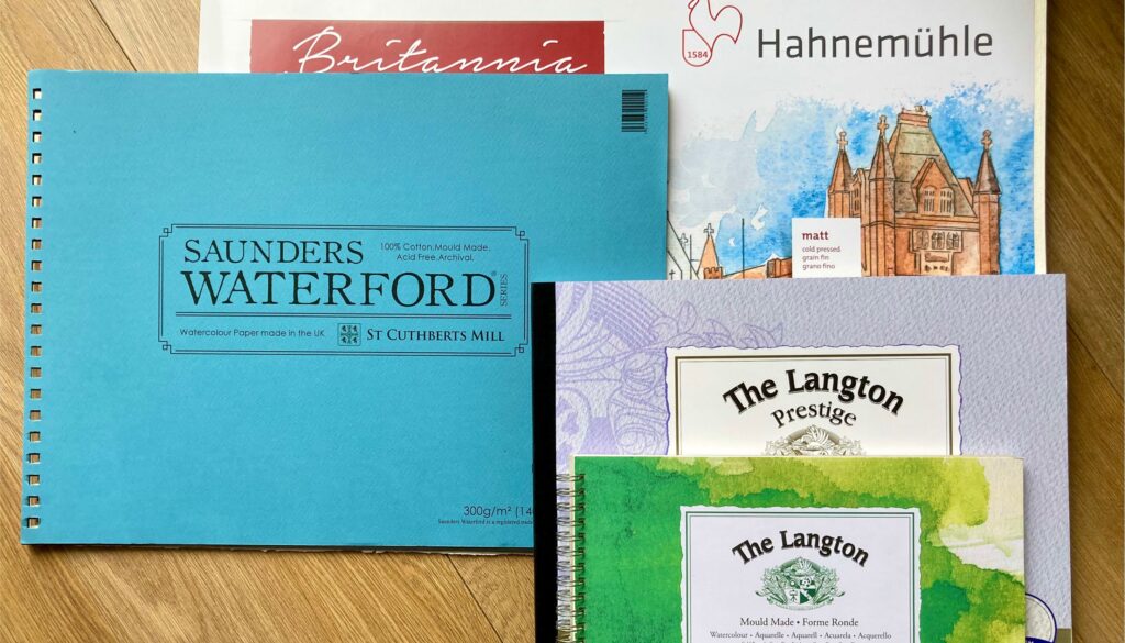
Materials
- Watercolour paint – any dark colour with a good tonal range, for example: indigo, black or mix a dark grey from burnt sienna and ultramarine blue.
- Watercolour paper – 140lb/300gsm Cold Pressed cotton NOT (means not hot pressed) approx. 11 x 15 inch (quarter imperial size).
- Brushes – I use a large oval wash brush for my washes and a DaVinci maestro series 35 size 5 or 6 for detail. The series 35 has an extra fine point and a good body that holds lots of water so I don’t need small brushes with just a few hairs! If you have brushes you are used to, use them.
- Masking fluid
- Scrap paper
- Water pots
- Palette or an old white china plate
Tonal Sketch
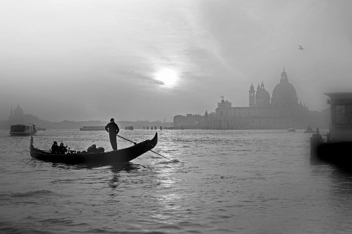
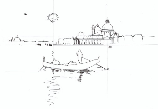
Using a soft pencil 2B or 4B draw an initial tonal sketch on cartridge paper to help you asses the light and darks and familiarise yourself with the landscape. This sketch is for your reference and not for painting on. Alternatively you can use a black and white photograph as shown here to help you see the tonal differences.
 Composition
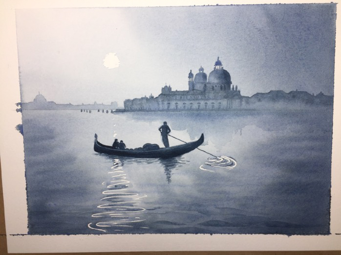
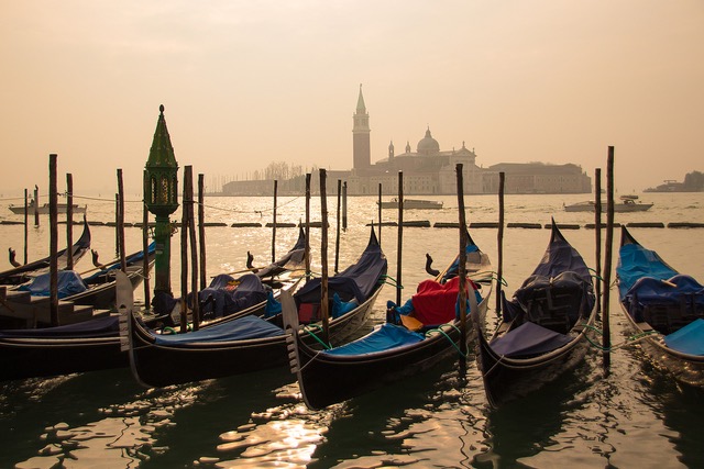
A photograph is rarely a perfect composition so you can use your artistic license to rearrange elements and improve the composition. I altered elements in the photograph so that it roughly follows the “rule of thirds”. The main buildings are moved to the left, so the large dome falls on the right vertical third. I moved the gondola down to fall in line with the bottom third and moved the sun, so it falls on the left third.
Stage 1 – preparation
Draw an outline of the composition on the paper. As watercolour is transparent the pencil marks will show through the paint, so unless you want to see them it is best to draw very lightly. This painting requires a lot of water in the initial wash which will make the paper buckle. To prevent buckling the paper has to be restrained on all four edges so use either ‘stretched paper’, or a “block” of paper where all the sides are glued all round to prevent buckling.
Stage 2 – masking
To retain the white of the paper lightly apply masking fluid to the sun and reflections on the water. Wait for the masking fluid to dry thoroughly before proceeding with the painting.
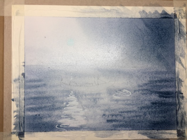
Stage 3 – background
The order of painting for this image is: first background, then mid ground and lastly foreground. This is practical as it stops you smudging the work if you work from top to bottom. Generally paint large areas and broad strokes first and detail last.
Tilt the board at an angle of 15 to 20 degrees. With a large brush wet the page with clean water. Mix a pool of indigo or dark grey, test the colour on a scrap of paper to make sure it is not too dark. For the sky apply a wash making it slightly darker on the right hand side. Whilst the wash is still wet apply small strokes of grey in the water to represent the ripples in the foreground.
The wash must be completely dry before moving to the next stage or the colours for the buildings will bleed into the sky and water.
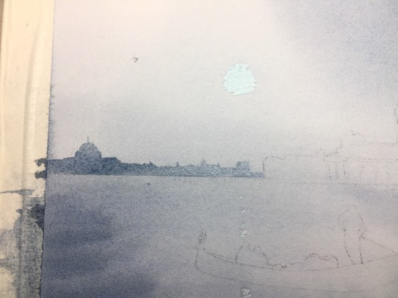
Stage 4 – buildings on the left
Paint the buildings in the background on the left-hand side. In order to get a feeling of perspective these buildings should be the lightest on the painting, so you need a weak dilute mix of paint. (Test the strength of colour on scrap paper before you apply it). Carefully wet the area of the buildings with clean water then dab in the weak grey mix to give a washy uneven feel.
Stage 5 – buildings on the right
Wait for the buildings on the left to dry thoroughly before painting the buildings on the right. The buildings on the right are closer than those on the left. Increase the strength of the mix (i.e. less water and more pigment – test before applying) for the buildings on the right so that tonally they are darker than those on the left, this helps to create depth and perspective in the painting.
 Stage 6 – reflections
To create the reflections of the main buildings in the water: firstly, wet the area of reflection with clean water then paint small amounts of the grey mix whilst still wet. Painting ‘wet into wet’ like this creates soft edges.
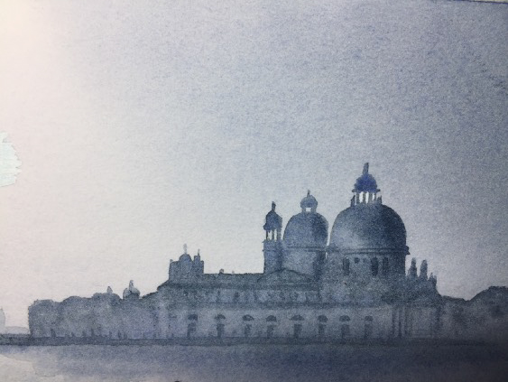 Stage 7 – details to building on the right
Add details to the buildings on the right hand side only, (don’t add details to the distant buildings on the left as that will have the effect of bringing them forward and will lose the sense of perspective). The details on the buildings need to be painted in a weaker mix than the boat so they don’t compete with the boat tonally.
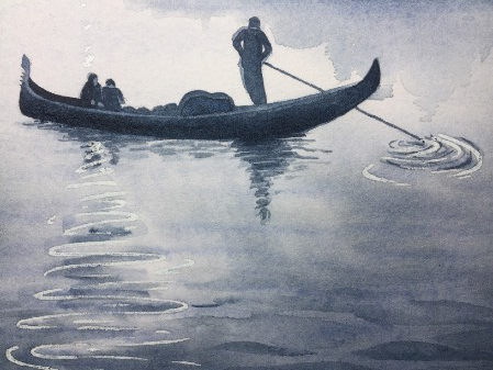 Stage 8 – the gondola
Mix a darker colour (less water more pigment) for the gondola. Paint it using a wet/moist brush on dry paper as this will give you controlled hard edges for the gondola and the pole. Use the ‘wet into wet’ technique to give soft edges for the reflections in the water which mirror the gondola and the people on it.
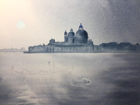
Stage 9 – the finished painting
The last areas to paint are the fine details on the gondola using a stronger mix applied with the pointed brush. A few darker ripples were added in the foreground to the water.
When the background is completely dry remove the masking fluid.
Denise teaches weekly watercolour classes and regular Saturday workshops. For more information about Denise’s paintings, classes and links to her YouTube painting tutorials visit her website
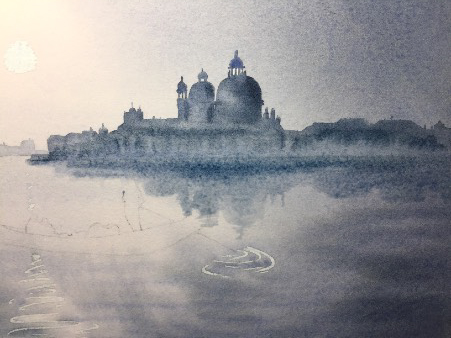
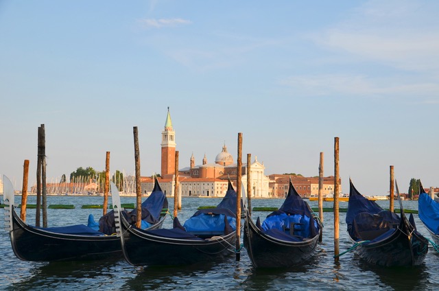
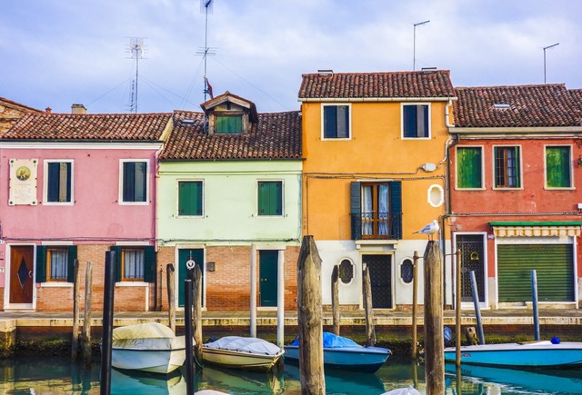
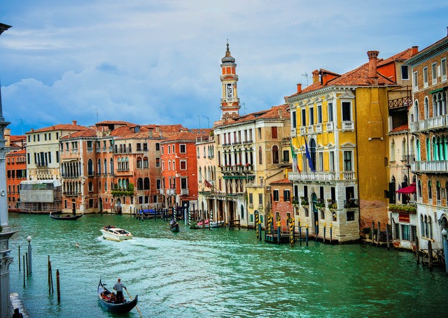
Here are a few photos of Venice for inspiration: