TUTORIAL – Lesley Rumble experiments with paper and paint
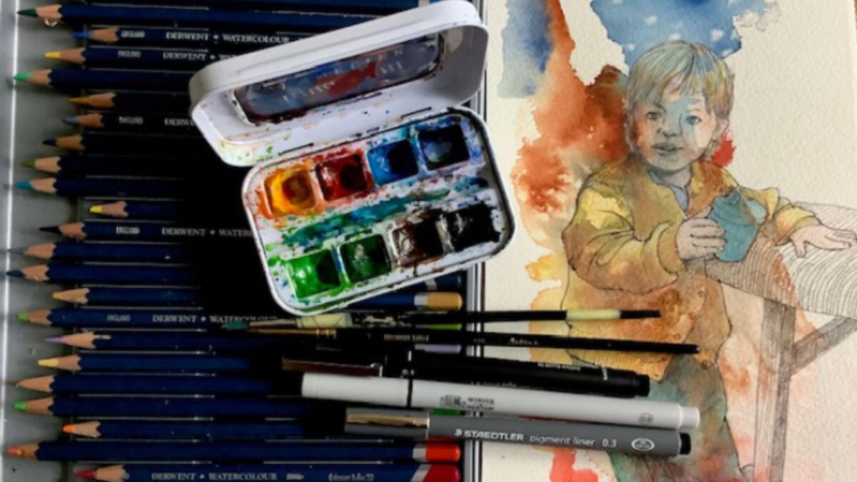
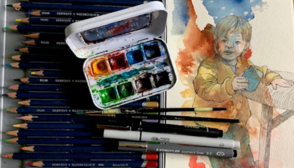
Materials
- Saunders Waterford NOT 300g (100% cotton, mould made, acid-free)
- Sennelier watercolour paints: Burnt Umber, Primary yellow, French Vermillion, Cinerous blue, French ultramarine
- Pens: W&N 0.3, Unipin fine line 0.1, Staedtler pigment liner 0.3
- Derwent Watercolour pencils
- Any small brush with a fine point
The process
I often trial different watercolour papers, experimenting with absorbancy, colour changes, ease of lifting paint (especially important if the colour has been put in the wrong place), and additional mediums, and therefore I have dozens of sheets and offcuts with colour splashes, runs and dribbles, masking fluid that has accidently stuck permanently, and so on.
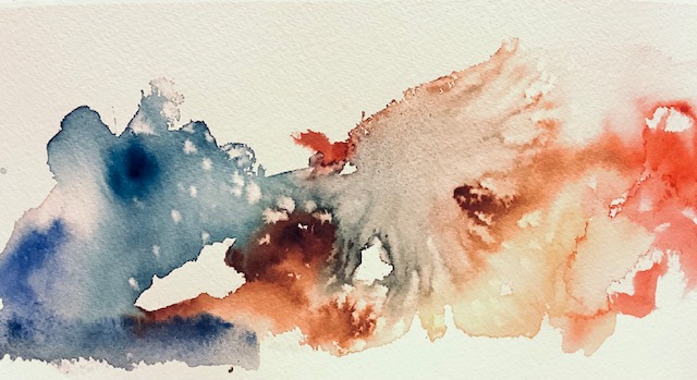
I was recently playing with an oddment of Saunders Waterford paper which I had cut from a large sheet. I wanted to see how the surface and certain colours reacted to a sprinkling of salt. It is a textural medium I use occasionally, and different grain types produce a variety of effects. Once the salt had dried (and it took a long time in the air, using a hairdrier won’t work), I turned the paper around and around to see how I might use the paper.
I had just been with my grandaughter for a week, and during that time she drew, painted, built lego, played with my teapot collection and dashed about in the park. From the numerous photos I had taken, I selected a pose which was typical of her energy (she’s two), where she was in the middle of rushing from one place to the other and had stopped briefly for a drink.
I wanted to capture the busy whirlwind of chaos.
I liked the star effect created by the rock salt crystals, and decided to have that at the top of the composition.
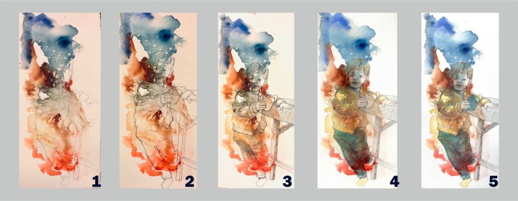
- I sketched the shape and when I was satisfied with this,
- I used a pen to outline.
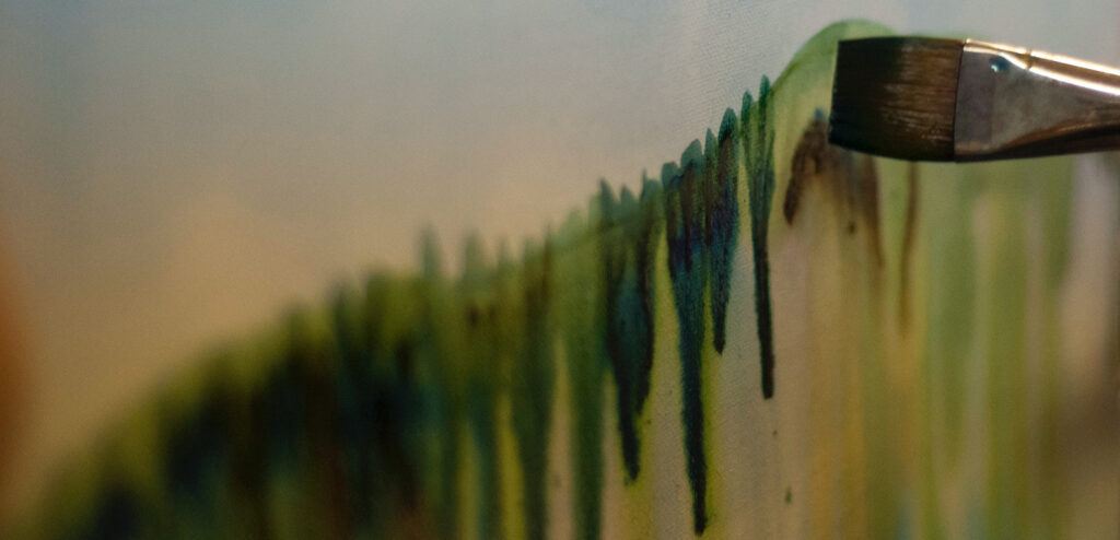
- There are many pens available, and I have no real preference to manufacturer. All I require is that the mark is right for the subject and the paper, of course. This paper was still undergoing a trial, as the first pen I used was thin and scratchy for the paper. I had a choice to either continue with a thicker, smoother nib to produce a bold outline drawing, or to fill in the thin lines with watercolour. I chose to add other pens and paint. More texture was needed, and an indication of shadows.
- I felt that I had placed the figure in an awkward place with the brown blob across the face. So, with colour now in place, I proceeded to lift off paint and although the brown was easy to remove, the blues weren’t, so I added a light covering of pale watercolour pencils to even the tones.
- Finally, for balance, the beaker needed to be a darker tone so I used blue, similar to the trouser colour.
With the walls, furniture and child covered in paint, I am entitling this painting
‘It’s thirsty work being an Abstract Expressionist’
