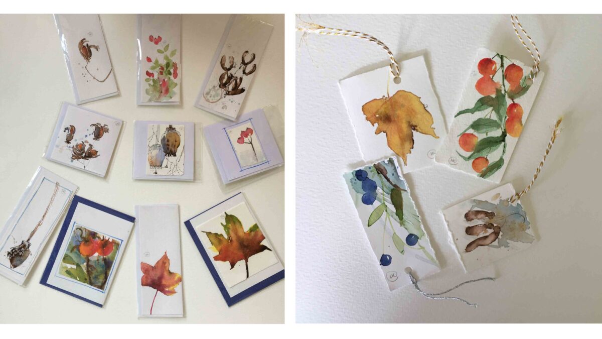
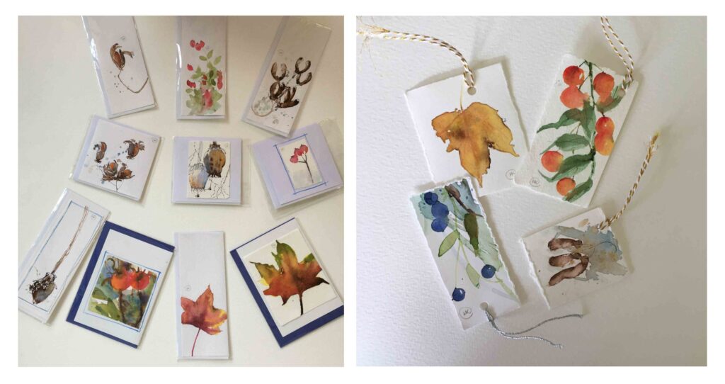
TUTORIAL – Leaves, Berries and Seed Heads with Helen Clarke
Helen Clarke takes us through the process of creating autumnal cards.
The wonderful vibrant colours and shapes we find scattered in the hedges in Autumn and Winter are irresistible to paint and provide a wonderful source of inspiration for watercolour and ink paintings. They are favourite subjects of mine and in this article I will share my techniques for painting them as greetings cards.
You have the option of folding watercolour paper into the size of card you want and painting onto it directly, painting onto a card surface suitable for watercolour or painting on watercolour paper then tearing/cutting it to the correct size for the card, and attaching it using glue or double sided sellotape.
Decide on your composition and number of the subject to include, depending on the size of card – odd numbers work well or singles. You can place the actual subject on the paper to work this out. Think about making it interesting e.g. sometimes I allow the subject to go off the paper, make it extra-large or show just part of it, which can look effective.
Autumn Leaves
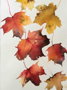
- Draw either freehand or around the leaf with a pencil, trying to be as accurate as you can. Remember that Autumn colours are vibrant, not weak. Hold the leaf against your palette to select a correct colour match. Colours will be applied with the lightest first- yellow, orange, red, blue/purple. The mixture should be the consistency of single cream.
- TIP Too much paint and it will lose its transparency, too little and it will simply be tinted water.
- For wet-on-dry paper, paint over the drawn leaf carefully with a sweeping movement of the brush (do not dab it on); and leave small gaps if there are holes in the leaf. Whilst the paper is wet, you can go on adding other colours to mix together on the paper, but beware of making it muddy by over-mixing or interfering. If the paper starts to dry, you can no longer add fresh colour, but will need to wait until the paper is bone dry, then add clean water before starting again to paint.
- Alternatively, try wetting the entire leaf with clean water first before adding colour. You will find that the paint flows easily across the surface. Add darker colours into the wet surface as before.
- Use a thin brush like a rigger or feather quill to pull out the pointed ends of the leaves or add a few veins. I find it is better not to include every vein.
- Sometimes texture can be created by flicking water onto the paint or deliberately adding paint to a damp surface to form back runs, if this is what you see in the leaf.
- Using a dip pen with a firm point, add sepia calligraphy ink to the edges of the leaf where you see the brown discolouration of distressed and dying edges. This will merge into the watercolour and look very realistic. Run the ink around holes whilst it is still wet or moist. If the ink does not move, you have left it too late and will have to re-wet the area.
Berries

- Sketch a design with pencil, ink or paint directly onto the paper.
- Decide on composition – diagonal sprays of berries look attractive, giving a sense of movement.
- TIP Allow the stem to run off the paper rather than hang in mid- air.
- Place your chosen colour selection on a scrap of paper to see how they look together.
- Decide if you are going to paint a background or leave white paper. The paint can be applied to a dry or a wet surface for the background. Allow the colours to blend together wet into wet so they merge naturally.
- You will need a fine brush or rigger to paint the stems and a larger brush for the background, berries and seed heads.
- TIP Do not paint an outline of a berry or leaf and colour it in. Rather use the brush to describe the shape of a leaf by pushing down on the paper with the tip of the brush then pressing down on the belly of the brush for the wide part of the leaf, before coming off at the tip again. Observe the shape of the leaf carefully and make them all slightly different.
- Look where the light is coming from. Are there any of the lightest areas which can be left as white paper? Paint from light to dark.
- Creating light areas and highlights can be achieved by “lifting off”. Put your brush in clean water, then, remove the majority of the water onto a paper towel, so that the brush is damp. Run the brush firmly along the edge of the painted area so that it merges with the paper next to it to make a soft edge. This will add tone (areas of dark and light) to the study.
- Having painted your stem immediately paint leaves and berries so they “grow “together. While the paint is wet you can add your darker colour.
- Spattering paint can add liveliness and interest and lead the eye.
- A fine border can be added in a complimentary shade.
- Glitter can be added to the berries and leaves, or gold and silver paint for Christmas.
- For Greetings Tags, punch a corner hole and attach thread.
Seed Heads
- Sepia ink looks more natural than black for stems drawn with a dip pen, bamboo, twig, feather, wooden coffee stirrer or cocktail stick. I use Sepia Calligraphy Ink.
- When added to wet paint the ink will create interesting and varied textural marks as mentioned previously.
- TIP If the paint is wet, be aware that the ink will run into it in an uncontrolled way. Wait until the shine has gone, then apply the ink. Remember that If the paint is too dry, the ink will not merge with the paint.
- Use ink to draw your seed heads, then apply a wet brush to allow the ink to move, then add the paint carefully, lifting off colour for a lighter side.
- Realistic colours are not absolutely necessary for seed heads, such as poppy heads in particular. Experiment with alternative colours such as blues, purples, reds or greens.
- Decide on whether or not a background is needed.
- Add glitter or an opaque watercolour called gouache, can be spattered over the image to create a snowy look or to add highlights.
More
Take part in our card making challenge
Find out where to get your cards printed professionally
