
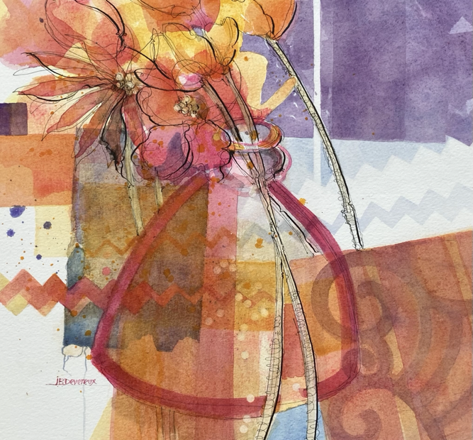
TUTORIAL – Jackie Devereux’s wonky pink pot
I have developed a passion for pots over the years and can never resist an evocative shape in a charity shop window, and in particular those that are hand built or hand thrown and showing signs of pressure marks. I turn them into my own by adding decoration and altering the colour at will. This particular pot has appeared in several recent paintings, although sometimes it is upside down! It is of no consequence really – it is whatever works in the moment. I look at the creation of my still life paintings rather like writing a novel – a work of fiction. The objects do exist, but are not photographically rendered – the colours are totally invented and the composition is imaginary.
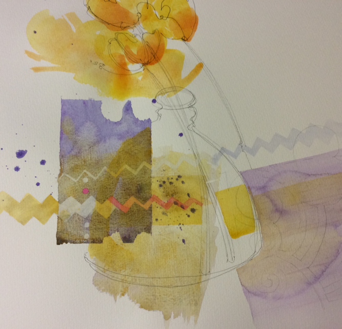
The first thing I do is to decide roughly on format and size, although I usually begin with a large sheet of paper, begin in the centre and work out. This time I wanted to retain the focal point centrally, and balance other elements into a visually comfortable scenario, gathering items or shapes and colour swatches along the way. I began with a simple ink line drawing which set the scene without being too evident.
The abstracted floral content just adds a splash, but I am mainly focusing on the rectangular shapes to which I have added coloured designs to enable the eye to take a journey around the surface of the paper.
I am more interested in this instance in creating patterns, both organic and geometric, and having commenced with a very simple curvaceous linear drawing, in fact the strong colours in pure watercolour built in delicate glazes, had taken centre stage.
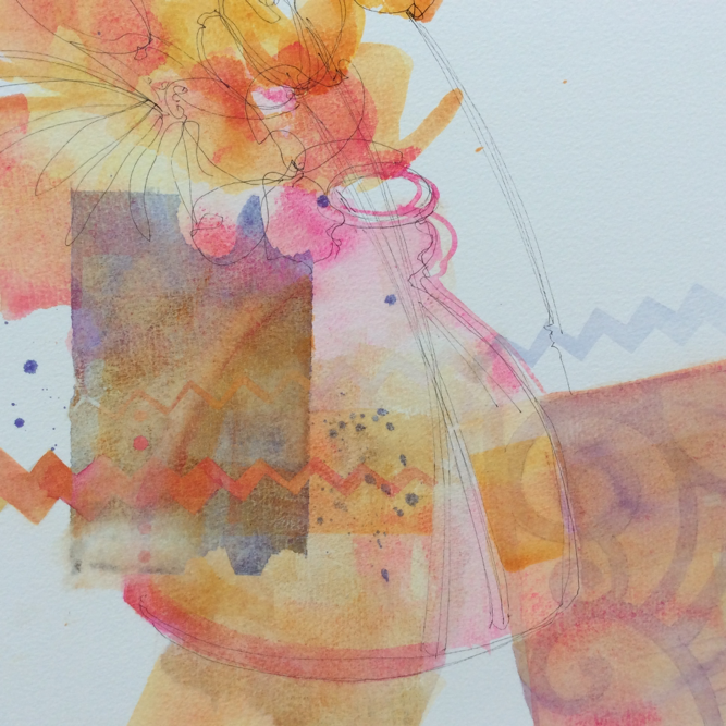
At one point I drenched the painting under running water before stretching the paper ready for the final glazes and detailing. I chose to use my favourite 2” brush to block areas of colours, waiting for each to dry before applying the next.

At intervals I have lifted off various decorative shapes with a magic sponge, with the aid of an acetate sheet cut with my own zig-zag design, and again at times applied yet another layer of wash to push back the white areas just revealed. Another flat brush is less than 1cm wide, and enables me to apply the watercolour in quite graphic lines and curves – again usually with more than one colour, building up a delicate depth of colour. Other brushes used were my large wash brush (filbert), and a medium round wash with a good long point – all brushes are squirrel hair. I am constantly moving around the painting as it progresses, photographing it with my iPad at intervals to evaluate it, and I continue to balance each area as I go, getting braver with each stroke! With constant evaluation I can keep an eye on the possible outcomes, at the same time enabling myself to take risks, but am also aware that at some stage ‘enough will be enough’.
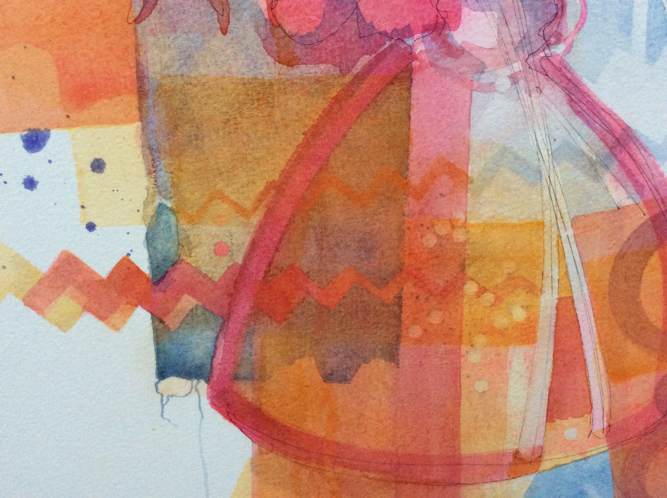
Final touches to this painting reinforced some of the ink lines which I concluded would be limited to a particular area just to create a little drama. I felt the strength of colour in this painting was sufficient and didn’t require reinforcement but just a statement with the flourish of the nib dipped in Indian ink.
Painting details:
WONKY PINK POT
30x30cm
Ink & Watercolour
Paper – Bockingford NOT 300g
Daniel Smith and Winsor & Newton Professional Watercolours
Indian Ink