TUTORIAL – Alan Noyes: Don’t be afraid of the dark, part II
Mixing interesting darks
This is a difficult one. In theory we only need six pigments on our palette – A warm Red, Yellow and Blue and a cool Red, Yellow and Blue and with those six you should be able to mix any colour your heart desires but that isn’t reality. In reality we end up with a box full of different colours, probably by several different manufacturers and half of which we rarely, if ever use. I have told you there are at least 2,660 colours to choose from so how do we select the correct ones for our darks.
There are some pigments which will never be dark, even if applied strait from the tube – Cobalt Blue for example and any yellow – these have mid range values and have to be ‘toned down’ to make them appear darker. Toning down can be achieved by adding the complimentary colour but be careful. Adding the complimentary Orange to Blue means you are in effect mixing the three primaries together as Orange is a mix of red and yellow and the blue might contain red as well, so if you are not careful, you will create a grey. Maybe quite an interesting one but perhaps not the darker blue you were looking for – complicated isn’t it.
And please don’t use a ready mixed black – it is dull and dead, absorbs every colour of the spectrum and if used thickly, creates a black hole in your painting. If tempted to use black, mix it yourself using say, Ultramarine and Burnt Umber. Varying these two pigments will give you a colour approaching black with a bit of life in it. There is very little black in nature. Colour is every where, either self colour of the object or reflected colour. Your darks should contain colour – your shadows should contain colour – and both can be achieved by mixing in the palette and applying as washes, or by mixing wet into wet or by glazing. Personally I prefer the wet into wet method. It is much more difficult to control and very unpredictable but I believe the end result is worth the effort, providing exciting, variable darks rather than a block of solid dark colour.
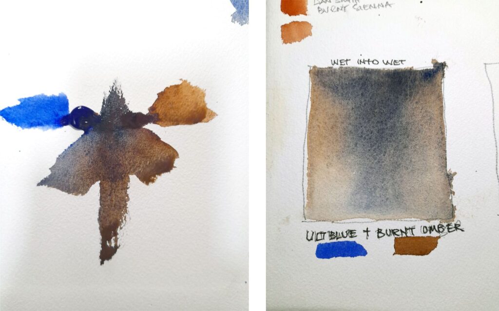
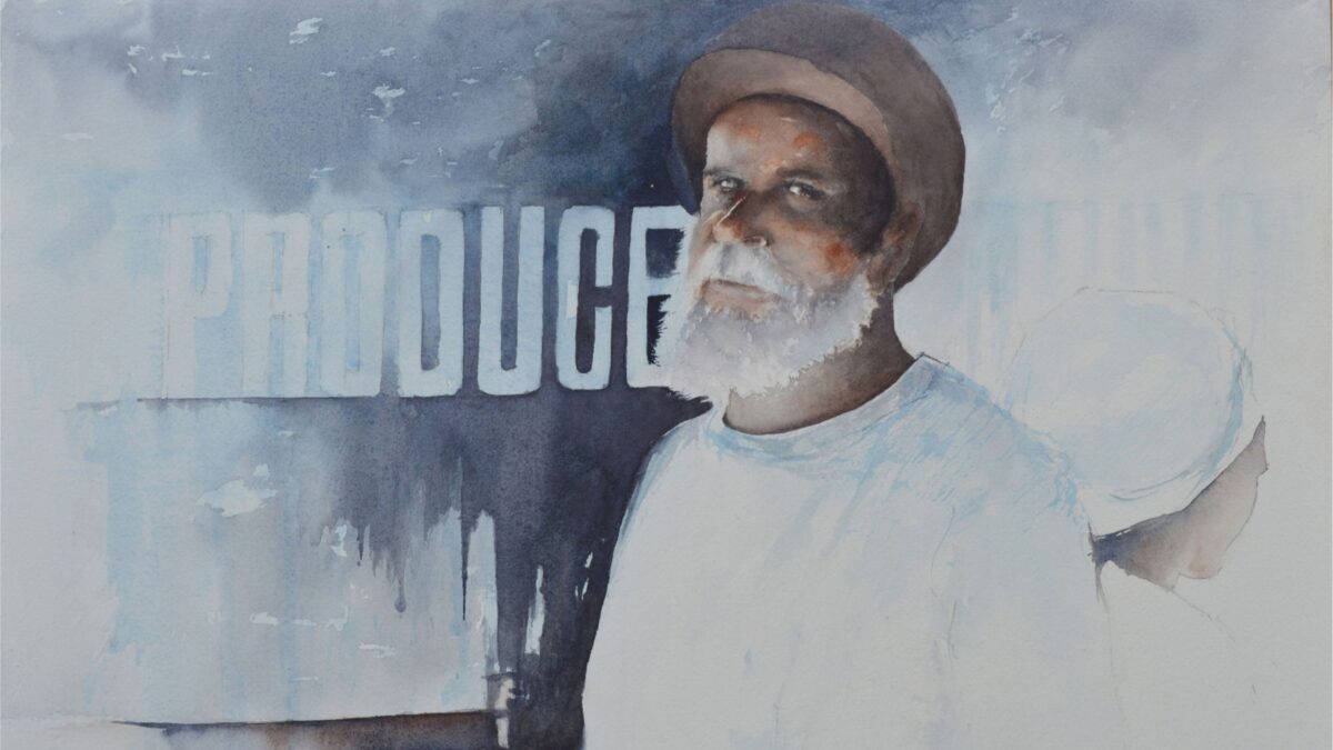
In The Market Traders I used a dark made from Ultramarine Blue and Burnt Umber and in the Traders the blue is dominant. This little doodle above left is using the same two colours and if you look really closely the colours range from an almost black blue through a warm red blue to a dark brown. Try this yourself. From the tube dot the blue and the umber about 2” apart on a piece of dry watercolour paper and with a clean wet brush add water between the two pigments, moving your brush from side to side until both colours run into the water. Now drag the mix down adding a bit of water to make the pigments flow into each other. I hope you agree that this results in darks which are far more interesting than using a pre-made mix from a tube.
The little doodle can be repeated with any colours you care to choose and will be a valuable exercise to help you determine which colours would suit the painting you are working on. If you create these doodles in a watercolour sketch book they can be kept for future reference. I created the example using neat pigment on dry paper but similar results can be achieved using the wet into wet technique. The doodle above on the right uses the same two colours. Into a square of wetted paper drop first a mix of Burnt Umber and then of Ultramarine Blue, letting them blend on the paper. This method provides and almost infinite range of tones within your darks and as far as I know, is a technique available only to watercolourists.
Experiment (and a bit more science)
The reason we experience colour is because the object we are looking at reflects that colour. Light falling on a red ball contains all the colours of the rainbow but the ball, being red, reflects only that red part of the spectrum and absorbs the rest, hence we see a red ball. If you bear this little bit of science in mind when mixing colours it will help you to understand why sometimes we end up with mud or the bright spring green we are trying to mix ends up brown. We know that blue + yellow make green – well not entirely true. Try mixing Ultramarine Blue with say a Hansa Yellow. You will get green but not the bright green you were perhaps hoping for because both the blue and the yellow contain red – you are therefore mixing the three primary colours. Now if you mix Cerulean Blue, which doesn’t contain red, with Hansa Yellow the result will be a much brighter green.
Paint pigments are not made from one colour only. Mixing colours is a real science. Unlike the old days when a painter bought a pure lump of rock from Sienna to grind up and make his colour, we are now at the mercy of paint manufacturers – some good, some not so good – and to achieve the manufactured colour, the tube you have purchased contains more than one pigment. I do not recommend spending time researching pigment manufacture, in stead I suggest experimenting with colour mixes which you think will achieve the effect you are after.
If you are looking for darks, start off with colours that pack a bit of punch. In the blues I have already mentioned my favourite – Ultramarine Blue – Daniel Smith Ultramarine Blue is a beautiful warm violet blue pigment. It is transparent and granulates, adding texture to a wash. It also mixes well with other pigments without being too dominant. Prussian Blue is a green/blue therefore on the cool side but is very dominant and can be unreliable. It needs to be handled with caution. Antwerp Blue by Winsor and Newton is both transparent and reliable. To go with these for your darks try Raw Sienna which is a yellow/orange and mixes well with Ultramarine Blue. Raw Umber is a cool brown with a hint of green, not particularly transparent but another which mixes well with Ultramarine Blue. Burnt Sienna is a fiery transparent neutral orange/red, originally made by burning Raw Sienna. It produces vibrant transparent washes and also mixes beautifully with Ultramarine Blue to produce a lovely range of neutral greys. I swear I do not have shares in either Ultramarine Blue or Daniel Smith!
And Finally
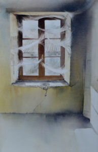 The painting on the right ‘Forgotten room’ shows the effect of darks applied as a series of overlaying wet into wet washes, building up the desired tones.
I said earlier that yellows would never provide darks and on their own that is true. Here the underlying washes of yellow, in places mixed with raw sienna, were applied until I was happy with the tonal density before overlaying with darker washes which, being transparent, have the effect of toning down the yellows.
The overlying darks on the right are a mix of my favourite warm Ultramarine Blue with either Burnt Sienna or Burnt Umber and on the left a cool Cerulean Blue. I lost count of the number of washes applied in this painting. It is a test of patience but hopefully the end result justifies the time spent.
I do hope you have enjoyed this little article and have perhaps learnt something you did not know. Above all don’t be put off by the science bits and KEEP EXPERIMENTING!
