TUTORIAL – Alan Noyes: Don’t be afraid of the dark, part I
I am assuming that those of you reading this Newsletter have some experience of the gentle art of watercolour – some more than others, some of you may even be starting afresh with a new medium. Those of us who have some experience of the medium will know how uncontrollable it can be and at the same time, how rewarding – in fact, it is not really knowing what might happen next that makes it so exciting as a medium. When you read about or speak to watercolour painters, you discover almost without exception, what they are trying to achieve in their work is to capture light, but without dark there is no light, so by learning how to achieve these deep and interesting darks, we can emphasize the light.
If we have been painting for a while, we know what it is like to be faced with that brilliant white sheet of watercolour paper, just daring us to put a mark on its pristine surface. The more we stare at it the less confident we become – it is a bit like that with the ‘dreaded darks’.
Technically the term ‘darks’ refers to TONE or VALUE – forget colour. At this stage colour has nothing to do with it. I expect you have tried sketching or painting using one pigment only or just using a soft pencil or charcoal, if not, try it because it can be very rewarding.
We tiptoe around ‘the darks’, creeping up on them, adding darker washes bit by bit, instead of jumping in at the deep end and walloping in a dollop of our darkest dark almost at the beginning of the painting. By creeping up on the darks we are comparing them with the whiteness of the paper and this comparison makes them appear much darker than they really are. There is also a double whammy because as the pigment dries, it gets lighter, so that dark you mixed and applied is not as dark as you at first thought. My advice is to get at least one area of darkest dark into your work as early as possible. Now you have the two extremes- paper white against maximum dark – enabling you to work all the remaining in between tones.
Occasionally I run workshops or classes and one thing I try to emphasize to those attending is the use of a sketch book. Apart from the value of a sketch book to record something you might later wish to turn into a painting, they are invaluable in working out composition and TONE before approaching that scary sheet of pristine white paper. After all, watercolour paper is expensive so it makes sense to get all your mistakes out in the open on a cheaper piece of sketch book paper and save the expensive stuff for your masterpiece.
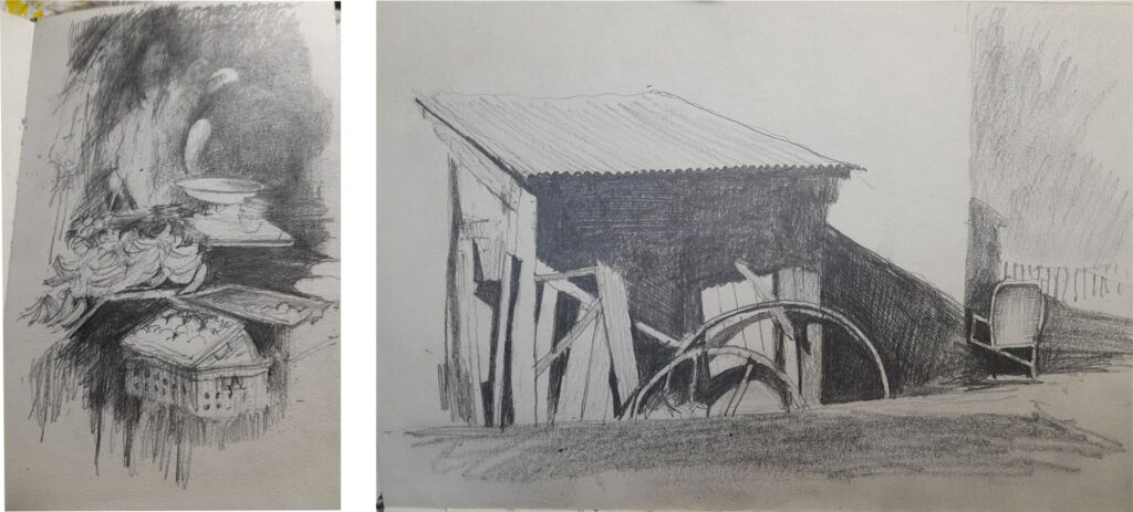
The sketch above left, is one I made of a market stall. In reality it is full of colour – bananas – apples and I think the lady in the background had on a dull green coat but this tonal sketch shows me where my darkest darks need to be, thereby emphasising the light. These sketches are also useful in composing your work and experimenting with the location of hard and soft edges. All these elements combine to provide impact and movement in your painting and make it the one to be noticed across a crowded room. The sketch above right, shows how darks can emphasise hard edges which give the impression of strong, bright light.
And now a bit of technical stuff
Sadly we must get down to some technical stuff. I was lucky enough to be taught at school both arts and sciences. I believe painting, in whatever medium, is where art and science meet and I find the science of watercolours quite interesting. If you don’t share that interest I am afraid you will have to get to know a little bit about it to understand colour mixing and making successful darks because to make successful darks you need to know which colours to start with.
I am sure we are all aware of the colour wheel showing the three primary colours – Red – Blue – Yellow and their complimentary colours – Green – Orange – Violet, which are two primary colours mixed together. Red + Blue = Violet. Blue + Yellow = Green. Yellow + Red = Orange. And what do we get if we mix the three primaries together? Well not black. And the same applies to complimentaries. The resulting complimentary depends very much on which manufacturer made your paints and which particular primaries you selected for the mix. Take care in selecting pigments because not all colours are created equal. Yellows can err on the red or green side, blues on the red side and reds on the blue side.
I have a useful book which lists no less than 2,660 different colours made by some 32 different manufacturers. Why am I telling you this, well because no colours are made equal and if chosen without care, in mixes they can lead to mud. Wherever possible I use translucent pigments because in my work I overlay a lot of washes and opaque pigments, if heavy, can obscure the preceding washes.
Using Darks
Demonstrating the use of darks in a printed article is a bit difficult. The most sensible way of doing it would be in a workshop and perhaps, when the world gets back to some semblance of normality, we can do just that. But for the moment I am afraid you will have to put up with my ramblings and some examples of how I use darks in my own work.
 I have to assume that you have an idea of applying watercolour washes because that is a basic principle of applying watercolour pigment and those who know me will remember I work on Arches 300gm NOT paper which I stretch on a board before putting brush to paper. (The NOT means the paper has a texture or tooth finer than the ROUGH paper).
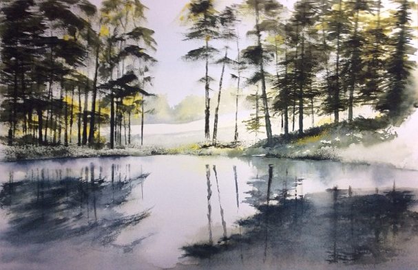
Okay – the first example I am showing is one in which the lighter background colours were all applied first into wet paper. This allows the pigments to flow and mix. I am aiming for a soft ethereal background on which to place the trees almost in silhouette.
The next step is to establish the darkest dark and for this I used some of the tree trunks and a mix of Quinacradone Gold and Ultramarine Blue giving a nice range of dark greens. In this piece I stamped all the tree trunks and foliage using a piece of corrugated cardboard dipped in the appropriate paint – a bit unorthodox perhaps but it worked. With all the trees thoroughly dry I wetted the pond area with clean water and introduced the first soft reflections, dropping thin washes into the wet paper and letting them bloom, tilting the board to encourage these washes into the right places.
With the pond area really dry I used some of the tree darks to create the shadows beneath the trees. In the areas I wanted the shadows I first painted the required shape with clean water then dropped in the dark greens. I used this method around the edge of the pond. From memory, the reflections and shadows in the water were created using a grey mix of Ultramarine and Raw Sienna applied with a brush into appropriately shaped wetted areas.
I hope the effect of the foreground darks and the dark silhouettes of the trees emphasise the distant light and the light on the water.
Another example
No cardboard was harmed in the production of this next piece titled The Market Traders and, unusually for me, not a great deal of wet in wet either. I met this chap on a market and asked if I could take his picture. At first he was a bit suspicious but after I explained why, he was quite excited by the idea and of course I did some sketches in my little book.

In the painting of The Market Traders I painted the man’s head and hat first so the side of his face gave me the darkest dark to work with. Once I had that established I could work on the background and here the object of the background darks is to throw the man’s beard and shirt into sharp relief. (The whites in this painting are all reserved white paper, no gouache was used). Also the blue/grey of the background is complimentary to the man’s skin colour. A limited palette but a painting in which the dark tones have quite an impact, throwing the figure forward. It is some while since I finished this so again from memory, I painted the background in two washes. The first, a very pale perhaps cerulean, blue, loosely applied. Cerulean is a cool greeny blue which granulates quite nicely and it looks as if I have used the same colour in the shadows and folds of the tee shirt. When this was dry I added the final darker wash using my favourite Ultramarine Blue with perhaps a touch of Burnt Umber added for darkness. All had to be painted around the lettering. Try varying the temperatures of your colours – warm against cool, dark against light – soft edges, hard edges – all these variations add interest to your work.
Read: Don’t be afraid of the dark, part II